
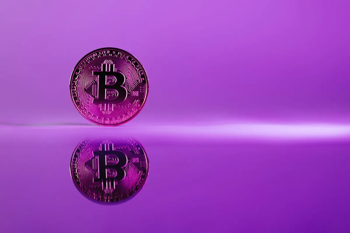
Understanding the nuances of color extends beyond aesthetic preference, directly influencing brand perception, marketing effectiveness, and audience engagement. Purple, a color frequently associated with both luxury and spirituality, encompasses a broad spectrum of shades, each carrying distinct historical weight, psychological impact, and stylistic implications. For designers, marketers, and content creators, distinguishing between a vibrant violet and a subdued mauve is not merely an artistic choice; it's a strategic decision that shapes how a message is received and interpreted across various commercial and creative contexts.
This guide explores the multifaceted world of purple, dissecting its core meanings, tracing its historical journey, examining its stylistic applications, and providing a visual reference to its most prominent variations. The objective is to equip professionals with the specific knowledge required to leverage purple's full commercial potential, ensuring that color choices are informed by a deep understanding of its inherent power and diverse interpretations.
The Evolving Meanings of Purple
Purple's symbolism is complex and often contradictory, stemming from its historical rarity and the cultural contexts in which it has appeared. Historically, its primary association has been with royalty, power, and wealth. This connection originated from the exorbitant cost of Tyrian purple dye, extracted from sea snails, which made it accessible only to emperors and the elite. Consequently, deep, rich purples like imperial purple or plum still carry connotations of luxury, exclusivity, and sophistication in contemporary branding.
Beyond royalty, purple also signifies spirituality, mystery, and the sacred. Lighter shades, such as lavender and lilac, are often linked to tranquility, introspection, and feminine qualities. These softer tones evoke a sense of calm, grace, and sometimes nostalgia. Conversely, brighter, more saturated purples, like violet or magenta, frequently represent creativity, imagination, and innovation. They are common in industries focused on technology, arts, and entertainment, aiming to project forward-thinking and unconventional values. The psychological impact of purple can vary widely based on its specific shade, saturation, and the surrounding color palette, necessitating careful consideration in commercial applications.
Purple Through the Ages: A Historical Perspective
The history of purple is deeply intertwined with technological advancements in dye production and social hierarchies. Ancient civilizations, particularly the Phoenicians, were masters of producing Tyrian purple, a dye so precious it was worth more than gold by weight. This scarcity cemented its status as a color exclusively for emperors, senators, and high-ranking religious figures in Rome and Byzantium. Its use was often legally restricted, making it a powerful visual marker of status and authority.
The Middle Ages saw purple continue its association with religious authority, particularly within the Catholic Church, where it symbolized penance and solemnity. However, the discovery of cheaper dyes gradually democratized the color. A significant turning point occurred in 1856 with William Henry Perkin's accidental creation of mauveine, the first synthetic organic dye. This invention made purple widely accessible for the first time, leading to a "mauve craze" in Victorian fashion and design. This shift diluted its exclusive royal connotations, allowing it to become a color of artistic expression and popular appeal. Understanding this historical trajectory helps explain the dual nature of purple today: both a symbol of ancient luxury and modern creativity.
Pro Tip: When incorporating purple into branding, consider its historical context. A deep, desaturated plum can evoke established luxury, while a bright, energetic violet might signal innovation. Aligning the shade with your brand's heritage or future-forward vision enhances its communicative power.
Stylistic Applications and Color Pairings
The stylistic application of purple depends heavily on its specific shade and how it interacts with other colors. In branding, tech companies often use vibrant purples to convey innovation and digital sophistication. Luxury brands might opt for deeper, jewel-toned purples to signify opulence and exclusivity. In interior design, lighter purples like lavender can create serene, calming spaces, while darker purples can add drama and richness.
Effective color pairings amplify purple's impact:
- Complementary: Yellow and gold tones create a high-contrast, energetic pairing with purple. This combination is often used to grab attention and suggests vibrancy, particularly with brighter purples.
- Analogous: Blues and pinks, adjacent on the color wheel, offer harmonious and soothing palettes. A blend of lavender, sky blue, and soft pink can evoke a sense of calm and natural beauty.
- Monochromatic: Varying shades of purple (e.g., plum, violet, lilac) create sophisticated, cohesive designs that emphasize depth and elegance without introducing other hues.
- Neutral Accents: Grays, silvers, and creams provide a refined backdrop that allows purple to stand out without overwhelming. This pairing often projects modern elegance.
- Earthy Tones: Greens and browns can ground purple, especially lighter or muted shades, creating a natural, organic feel. This is common in wellness and eco-conscious branding.
The choice of pairing should always consider the intended emotional response and the overall brand message. A vibrant yellow-purple combination communicates differently than a muted gray-purple palette.
A Visual Guide to Key Purple Shades
Each shade of purple possesses unique characteristics that influence its perception and application. Here's a breakdown of commonly referenced purples:
Lavender
A pale, light purple with a bluish tint, reminiscent of the flower. It conveys tranquility, delicacy, and femininity. Often used in wellness, beauty, and children's products. Hex code example: #E6E6FA.
Lilac
Similar to lavender but often with a slightly pinker undertone. Associated with youth, freshness, and spring. Popular in fashion and floral design. Hex code example: #C8A2C8.
Amethyst
A medium-dark purple, often with a rich, jewel-like quality, named after the gemstone. It suggests sophistication, spirituality, and inner peace. Used in luxury goods and spiritual branding. Hex code example: #9966CC.
Violet
A pure, spectral purple, sitting between blue and red. It is vibrant, artistic, and often associated with creativity and innovation. Common in tech and artistic fields. Hex code example: #8F00FF.
Plum
A deep, dark purple with reddish-brown undertones, resembling the fruit. It exudes richness, maturity, and luxury. Frequently used in high-end fashion, food, and home decor. Hex code example: #8E4585.
Indigo
A deep, dark blue-purple, often mistaken for dark blue. It carries connotations of depth, wisdom, and intuition. Historically significant as a dye, now used in branding for stability and insight. Hex code example: #4B0082.
Mauve
A pale, grayish-purple with a desaturated, muted quality. It evokes a vintage, romantic, and somewhat melancholic feel. Popular in historical contexts and subtle, elegant designs. Hex code example: #E0B0FF.
Orchid
A bright, exotic purple with pinkish undertones, named after the flower. It suggests grace, beauty, and tropical allure. Used in fashion, cosmetics, and floral industries. Hex code example: #DA70D6.
Selecting the Right Purple for Your Project
Choosing the optimal shade of purple involves a strategic assessment of your project's goals, target audience, and desired emotional impact. Start by defining the core message: are you aiming for luxury, creativity, tranquility, or innovation? A deep plum communicates differently than a soft lavender. Consider the cultural context of your audience, as purple's meanings can vary globally. Evaluate the existing brand palette or design elements to ensure harmonious integration. Test different shades across various mediums – digital, print, and physical products – to observe how they render and are perceived. The right purple is not just visually appealing; it's a deliberate choice that reinforces your brand's identity and resonates effectively with its intended recipients.
Frequently Asked Questions
What emotions does purple typically evoke?
Purple can evoke a wide range of emotions, including luxury, royalty, power, spirituality, mystery, creativity, and wisdom. Lighter shades often suggest tranquility and romance, while darker shades convey sophistication and opulence.
What colors pair well with purple in design?
Purple pairs effectively with its complementary color, yellow, for high contrast. Analogous colors like blue and pink create harmonious palettes. Neutrals such as gray, silver, and cream provide elegant backdrops, and earthy tones like green and brown can ground purple for a natural feel.
Is purple considered a masculine or feminine color?
Historically, purple has been associated with both genders, notably with royalty and power for men and creativity and spirituality for women. In contemporary contexts, lighter purples (lavender, lilac) are often perceived as more feminine, while deeper, richer purples (plum, indigo) are generally considered gender-neutral or even masculine in certain applications.
Why is purple often associated with royalty?
Purple's association with royalty stems from the extreme cost and rarity of Tyrian purple dye in ancient times. This dye, extracted from specific sea snails, was incredibly difficult and expensive to produce, making purple garments exclusive to emperors, kings, and high-ranking nobility, thus symbolizing wealth, power, and status.